

Animation and Motion Design: A Complete Guide (2026)
A complete guide to animation and motion design in 2026, covering animation types, tools, workflows and applied contexts.
:quality(75))
This guide covers the full landscape of animation and motion design in 2026, from foundational concepts like 2D animation and animatics to applied contexts like UI animation, marketing animation, Lottie, and motion graphics for social media, including tool recommendations and practical workflow guidance.
Motion changes everything. A static interface becomes navigable. A brand becomes memorable. A complex idea becomes immediate. The difference between a design that sits still and one that moves isn't just aesthetic, it's communicative. Motion carries meaning that static images can't.
That said, animation is also one of the most misunderstood disciplines in design. It's easy to add motion. It's much harder to add motion that actually improves the experience. Bad animation slows things down, distracts from content, and signals amateur work as clearly as a pixelated logo or a clashing colour palette.
This guide covers animation and motion design from the ground up, what the different types are, how they're made, which tools are used for which contexts, and how to build a workflow that produces good work efficiently. Whether you're just starting out or looking to extend your existing design skills into motion, this is the reference to start from.
What you'll learn in this guide:
- Animation vs motion design: what's the difference?
- Core animation principles
- Types of animation
- The animatic: planning motion before producing it
- Tools and software for animation
- Linearity Move: animation for designers
- Applied contexts: where animation is used
- UI animation and micro-interactions
- Marketing animation and branded content
- Motion graphics for social media
- Kinetic typography
- Lottie: animation for web and apps
- Building an animation workflow
- Common mistakes in motion design
Animation vs motion design: what's the difference?
These terms get used interchangeably — sometimes correctly, sometimes not. The distinction matters because it affects how you approach a project, what tools you use, and what the output is trying to do.
Animation is the broader discipline. It covers any technique that creates the illusion of movement — from hand-drawn frame-by-frame cel animation to 3D character rigs to simple CSS transitions in a browser. Animation is about making things move.
Motion design is a specific application of animation principles in a design context. It's animation in service of communication — used in interfaces, branding, advertising, and content to guide attention, convey information, and reinforce identity. Motion designers think less about character performance and narrative storytelling, and more about timing, hierarchy, and visual flow.
The overlap is significant. A motion designer uses animation techniques. An animator working in commercial or digital contexts often applies motion design thinking. The labels matter less than understanding what the work is trying to do.
In this guide, both terms appear — animation when referring to the techniques and craft, motion design when referring to the applied discipline and its contexts.
Go deeper: Motion design: the discipline explained
Go deeper: Animation for beginners: where to start
Core animation principles
Disney animators Ollie Johnston and Frank Thomas documented twelve principles of animation in their 1981 book The Illusion of Life. More than four decades later, these principles remain the foundation of how motion is understood and taught — not because animation hasn't changed, but because the principles describe how motion is perceived, and human perception hasn't changed.
The twelve principles aren't a checklist to apply mechanically. They're descriptions of why certain kinds of motion feel right and others feel wrong. Understanding them changes how you see animation, which changes how you make it.
The most practically relevant principles for designers working in motion today:
Timing and spacing is the most fundamental. The number of frames between key positions determines how fast or slow something moves. But it's the spacing between those frames — how evenly or unevenly distributed — that determines whether the motion feels mechanical or natural. Even spacing = robotic. Eased spacing (slow in, slow out) = organic.
Anticipation is the preparatory movement before a main action. A button that bounces slightly before expanding, a character that dips before jumping. Without anticipation, actions feel abrupt. With it, they feel inevitable. In UI animation, anticipation helps users predict what's about to happen — which reduces cognitive load.
Squash and stretch exaggerates the deformation of an object during motion to convey weight and elasticity. Applied literally, it produces cartoon physics. Applied subtly, it's what makes a button press feel satisfying rather than inert.
Ease in and ease out (also called slow in, slow out) mirrors how objects actually move in the physical world. Things accelerate from rest and decelerate before stopping. Linear motion — moving at a constant speed — looks unnatural because almost nothing in the physical world moves that way. Most animation tools provide easing curves precisely because this principle is so fundamental.
Secondary action is movement that supports and adds to the primary action without competing with it. A character's hair moving as they turn their head. A tooltip that subtly fades in while the primary content slides into position. Secondary action adds richness without distraction.
"Animation is not the art of drawings that move, but the art of movements that are drawn." — Norman McLaren, animator and filmmaker
The same principles of hierarchy, timing, and visual weight that govern static design apply directly to motion. If you want a foundation for how these principles work before they're in motion, the design principles guide covers colour, composition, and visual hierarchy in depth.
:quality(75))
The same motion feels completely different depending on timing, spacing, and easing, these are the variables that separate mechanical animation from natural-feeling motion.
Go deeper: 2D animation: principles, techniques, and styles
Types of animation
Animation covers a range of techniques and styles. Understanding the differences helps you choose the right approach for a given project — they have different production requirements, different tools, and different strengths.
| Animation type | 2D frame-by-frame |
|---|---|
| How it works | Drawing each frame individually |
| Strengths | Expressive, hand-crafted feel |
| Common use cases | Character animation, explainer videos, film |
| Animation type | 2D rigged |
| How it works | Character with moveable parts animated on a timeline |
| Strengths | Efficient for character reuse |
| Common use cases | Brand characters, educational content |
| Animation type | Motion graphics |
| How it works | Animated shapes, text, and graphics |
| Strengths | Clean, scalable, versatile |
| Common use cases | Explainers, social content, titles |
| Animation type | 3D animation |
| How it works | Objects rendered in three-dimensional space |
| Strengths | Depth, realism, product visualisation |
| Common use cases | Film, product demos, architectural |
| Animation type | Stop motion |
| How it works | Physical objects photographed frame by frame |
| Strengths | Tactile, unique aesthetic |
| Common use cases | Advertising, music videos, art |
| Animation type | CSS / web animation |
| How it works | Animation in the browser using code |
| Strengths | Lightweight, interactive |
| Common use cases | UI transitions, web experiences |
| Animation type | Lottie |
| How it works | JSON-based vector animation for apps and web |
| Strengths | Small file size, scalable, interactive |
| Common use cases | UI animation, loading states, icons |
| Animation type | Kinetic typography |
| How it works | Animated text |
| Strengths | High readability, flexible |
| Common use cases | Titles, social content, lyric videos |
| Animation type | How it works | Strengths | Common use cases |
|---|---|---|---|
| 2D frame-by-frame | Drawing each frame individually | Expressive, hand-crafted feel | Character animation, explainer videos, film |
| 2D rigged | Character with moveable parts animated on a timeline | Efficient for character reuse | Brand characters, educational content |
| Motion graphics | Animated shapes, text, and graphics | Clean, scalable, versatile | Explainers, social content, titles |
| 3D animation | Objects rendered in three-dimensional space | Depth, realism, product visualisation | Film, product demos, architectural |
| Stop motion | Physical objects photographed frame by frame | Tactile, unique aesthetic | Advertising, music videos, art |
| CSS / web animation | Animation in the browser using code | Lightweight, interactive | UI transitions, web experiences |
| Lottie | JSON-based vector animation for apps and web | Small file size, scalable, interactive | UI animation, loading states, icons |
| Kinetic typography | Animated text | High readability, flexible | Titles, social content, lyric videos |
Most designers working today will encounter 2D animation, motion graphics, UI/CSS animation, and Lottie most frequently. 3D and stop motion are more specialised disciplines with higher production requirements.
Many of these animation types begin as vector illustrations before being animated. The illustration styles guide covers how flat, line art, and character-based styles translate into animation-ready assets.
The animatic: planning motion before producing it
An animatic is an animated storyboard — a rough, timed sequence of frames that maps out what a piece of animation will look like before any finished animation is produced. Think of it as the motion design equivalent of a wireframe.
Animatics exist because animation is expensive to revise. Changing a fully animated sequence means redoing the work. Changing an animatic means moving a few frames. Doing the structural and timing work at the animatic stage before committing to production is one of the most reliable ways to avoid expensive late-stage revisions.
A good animatic establishes:
- Timing — how long each shot or sequence lasts, and where the pacing beats fall
- Transitions — how the piece moves from one section to the next
- Overall structure — whether the arc of the piece feels right before production begins
- Rough motion — key movements sketched out at low fidelity to test whether the concept works in motion
For short-form motion design work — a 15-second social ad, a UI transition sequence — animatics are sometimes skipped in favour of going straight to production. For longer pieces, brand films, or anything with significant client review involved, they're a critical step.
:quality(75))
An animatic establishes timing and structure before any finished animation is produced, changes at this stage cost a fraction of what they cost in production.
Go deeper: Animatic: what it is, how to make one, and when to use it
Tools and software for animation
The animation toolset in 2026 divides into desktop applications for complex production work, iPad-native apps for illustration-based and on-the-go animation, and specialised platforms for specific output formats like Lottie and web animation.
Desktop animation tools
Adobe After Effects remains the industry standard for motion graphics and compositing. It's deeply integrated with the rest of the Adobe ecosystem, has an enormous library of plugins and presets, and can handle almost any motion design task. The trade-off is complexity — After Effects has a steep learning curve and a subscription cost that reflects its professional positioning.
Adobe Animate is better suited to frame-by-frame and rigged 2D character animation, particularly for web and interactive output. It's more approachable than After Effects for character work but less capable for compositing and visual effects.
Apple Motion is the Mac-native alternative for motion graphics. Less capable than After Effects in some areas, but significantly faster for real-time previewing and well-integrated with Final Cut Pro. A one-time purchase rather than a subscription.
2D animation software
For dedicated 2D animation, a different category of tools comes into play:
| Tool | Toon Boom Harmony |
|---|---|
| Strength | Industry standard for character animation |
| Best for | Professional 2D character work |
| Tool | Moho (Anime Studio) |
| Strength | Rigged character animation |
| Best for | Indie and mid-level production |
| Tool | Rough Animator |
| Strength | Hand-drawn frame by frame |
| Best for | iPad sketching and rough animation |
| Tool | Procreate (with animation assist) |
| Strength | Expressive hand-drawn |
| Best for | Short loops and artistic animation |
| Tool | Strength | Best for |
|---|---|---|
| Toon Boom Harmony | Industry standard for character animation | Professional 2D character work |
| Moho (Anime Studio) | Rigged character animation | Indie and mid-level production |
| Rough Animator | Hand-drawn frame by frame | iPad sketching and rough animation |
| Procreate (with animation assist) | Expressive hand-drawn | Short loops and artistic animation |
Go deeper: 2D animation software: compared
Animation apps for iPad
The iPad has become a genuinely capable animation platform — particularly for 2D work. Apple Pencil input, large touch screens, and increasingly powerful processors have made mobile animation viable for professional work, not just sketching.
Key tools in this category include Linearity Move, Procreate's animation assist, Rough Animator, and FlipaClip. Each targets a different point on the spectrum from expressive hand-drawn to polished motion design.
Go deeper: Animation apps for iPad: compared
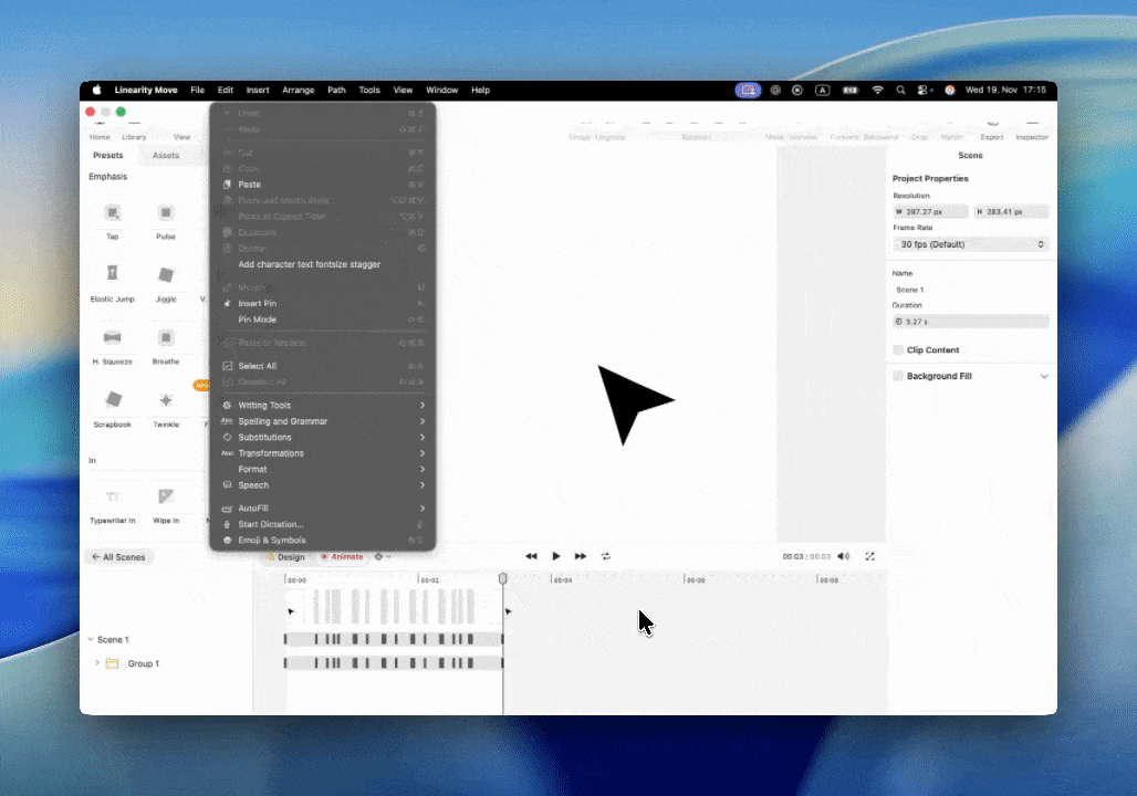
Linearity Move: animation for designers
Linearity Move is Linearity's animation tool — built natively for Mac and iPad, and designed to work directly with assets created in Linearity Curve. Where most animation tools require you to import assets from a separate design tool, Move treats the design-to-animation transition as a single workflow.
For designers who already work in Curve, this removes the most friction-heavy part of the animation process: getting your vector assets into an animation tool in a state where they're actually editable. In Move, the paths, groups, and layer structure from Curve are preserved and directly animatable.
What Move is built for:
- Motion graphics — animating shapes, text, and graphic elements for social content, presentations, and marketing
- UI animation — creating animated prototypes and interaction demonstrations
- Brand animation — bringing logos, icons, and brand elements to life
- Social content — producing animated posts and stories for Instagram, TikTok, and other platforms
How the timeline works: Move uses a keyframe-based timeline familiar to anyone who has worked in After Effects or similar tools. Set a keyframe at the start position, move to a later point in time, change the property (position, scale, rotation, opacity), and Move interpolates the motion between them. Easing controls let you adjust the acceleration curve of each transition.
Apple Pencil integration: on iPad, Linearity Move supports Apple Pencil input for drawing paths and making precise adjustments — which makes it particularly well-suited for animating illustrations created with Pencil in Curve.
Export: Move exports to MP4, GIF, and Lottie JSON — covering the primary output formats for social media, web, and app animation.
:quality(75))
Linearity Move on iPad is a keyframe-based animation with direct integration with assets from Linearity Curve.
Learn more about Linearity Move
Applied contexts: where animation is used
Animation isn't a single discipline with a single output. The same principles and many of the same tools are applied across wildly different contexts — from a two-second loading spinner in an app to a three-minute brand film. Understanding the context shapes every decision: the style, the duration, the output format, and the tools used.
UI animation and micro-interactions
UI animation is animation in service of usability. Every transition, loading state, hover effect, and micro-interaction in a digital product is a form of animation — and each one either helps the user understand what's happening or adds visual noise without purpose.
The best UI animation is the animation you don't consciously notice. When a modal appears with a subtle scale transition, it feels natural. When a button gives haptic-adjacent visual feedback on press, it confirms the action was registered. These moments don't draw attention to themselves — they just make the experience feel polished and intentional.
The principles that guide good UI animation:
Serve communication, not aesthetics. Every animation in a UI should exist for a functional reason: indicating state change, directing attention, showing relationships between elements, or providing feedback on an action. Animation that exists purely for visual interest in a UI context is almost always a mistake — it slows down interactions and trains users to ignore motion cues.
Duration matters. UI animations should be fast. Transitions between states typically work best between 150ms and 400ms. Anything slower starts to feel like it's making the user wait. Anything faster can feel abrupt — the easing curve carries more perceptual weight at very short durations.
Consistency builds intuition. When the same type of transition is always used for the same type of action — a slide-in always means new content arriving from the side, a fade always means an overlay — users learn the visual language of the product. Inconsistent animation breaks that intuition and creates confusion.
| Animation type | Micro-interaction (button, toggle) |
|---|---|
| Duration range | 100–200ms |
| Common use | Immediate feedback on action |
| Animation type | Panel / drawer transition |
| Duration range | 200–350ms |
| Common use | Navigation between views |
| Animation type | Modal appear / disappear |
| Duration range | 150–300ms |
| Common use | Overlay content |
| Animation type | Page transition |
| Duration range | 250–400ms |
| Common use | Between major sections |
| Animation type | Loading / progress indicator |
| Duration range | Looping |
| Common use | Background process feedback |
| Animation type | Duration range | Common use |
|---|---|---|
| Micro-interaction (button, toggle) | 100–200ms | Immediate feedback on action |
| Panel / drawer transition | 200–350ms | Navigation between views |
| Modal appear / disappear | 150–300ms | Overlay content |
| Page transition | 250–400ms | Between major sections |
| Loading / progress indicator | Looping | Background process feedback |

Go deeper: UI animation guide: micro-interactions, transitions, and motion in product design
Marketing animation and branded content
Marketing animation covers a wide range: short social ads, explainer videos, product demos, brand films, animated presentations. What unites them is purpose — the animation exists to persuade, inform, or build brand recognition, and it's measured against those outcomes.
Unlike UI animation, marketing animation can afford to be expressive. Duration can be longer. Style can be more distinctive. The animation doesn't need to be invisible — in fact, a distinctive motion style is one of the strongest brand differentiators available.
Some of the most effective marketing animation formats in 2026:
Explainer animations break down complex products, services, or concepts in 60–90 seconds. The combination of voiceover, motion graphics, and simplified visual metaphors can communicate things that text and static images struggle with — particularly for abstract products like software, financial services, or B2B platforms.
Animated social ads are short-form (6–15 seconds) and built for autoplay without audio. The motion has to carry the message without relying on sound — which means visual clarity and immediate communication of the key point are non-negotiable.
Brand motion identity treats animation style as a brand asset. Consistent motion — specific easing curves, characteristic transitions, recurring visual motifs — builds recognition in the same way that consistent colour and typography do. Companies like Stripe, Airbnb, and Apple have developed recognisable motion languages that appear consistently across their product and marketing touchpoints.
Go deeper: Marketing animation: formats, techniques, and production
Motion graphics for social media
Social media has become one of the primary distribution contexts for motion design. Platforms that were static just a few years ago — Instagram, LinkedIn, Pinterest — now actively favour animated content in their algorithms. Every major platform has at least one vertical video format, and autoplay makes animation more impactful in feeds than static images.
The constraints of social motion graphics are different from other animation contexts:
No audio dependency. Most social video is watched without sound — some platforms default to muted, others have users in public contexts. Animated content for social needs to communicate visually. Captions help, but the motion itself should carry the story.
Short duration. Attention windows on social are short. The most effective social motion graphics make their point in 5–15 seconds. Longer formats work on YouTube and LinkedIn, but most platforms reward brevity with better reach.
Format fragmentation. The same content may need to work as a 1:1 square for Instagram feed, a 9:16 vertical for Stories and Reels, and a 16:9 horizontal for LinkedIn or Twitter. Building multi-format from the start — rather than adapting a single format after the fact — produces better results.
Platform-specific safe zones. As with static images, animated content has areas that get covered by platform UI — captions, interaction buttons, username overlays. Keeping key content and text within the safe zone is as important for motion as it is for still images.
Getting the dimensions right for each platform is the foundation of social motion work. The social media image sizes guide covers safe zones, aspect ratios, and format specs for every major platform — including animated content.
Go deeper: Motion graphics for social media: formats, tools, and workflow
Kinetic typography
Kinetic typography is text that moves. At its most basic, it's animated titles and lower thirds. At its most expressive, it's a complete visual language where the motion of the type carries as much meaning as the words themselves.
The appeal of kinetic typography is practical as well as aesthetic. Text in motion captures attention in ways that static text doesn't — which is why it's widely used in social content, advertising, and video production. It also solves the audio dependency problem: when text is animated to reinforce its own meaning, it can communicate rhythm, emphasis, and emotion without sound.
Common kinetic typography techniques:
Character animation — individual letters move independently, often in sequence. Used for reveals, emphasis, and playful or expressive moments.
Word reveals — words appear one at a time, timed to a script or voiceover. The simplest and most widely used form of kinetic typography in video production.
Kinetic flow — continuous motion where text moves through the frame rather than appearing in a fixed position. More complex, associated with music videos and high-production advertising.
Type as composition — the text is the entire visual, with motion creating the layout rather than a separate design element. Common in typographic posters and brand identity work.
The relationship between motion and meaning is what makes kinetic typography interesting as a discipline. The same words moving slowly and gracefully communicate differently from the same words snapping in with urgency. The motion is editorial, not decorative.
Go deeper: Kinetic typography: techniques, tools, and when to use it
Lottie: animation for web and apps
Lottie is an animation format developed by Airbnb that renders After Effects animations natively on web and mobile, as lightweight, scalable, interactive vector animations. It's become the standard format for UI animation that needs to be shipped in production, rather than just demonstrated in prototypes.
Before Lottie, the options for shipping animation in a product were limited: GIFs (large files, limited colour, no transparency), video (even larger files, not scalable), or CSS/JavaScript animation (requires engineering time to build). Lottie changed this by providing a format that designers could produce without writing code, that engineers could implement with a lightweight library, and that performed well across devices.
How Lottie works: an animation is created in After Effects (or a compatible tool), exported as a JSON file using the Bodymovin plugin, and then rendered natively using the Lottie player library in web or mobile environments. The JSON file is typically very small — a complex animation that might be 2MB as a GIF can be 20KB as a Lottie file.
Where Lottie is used:
- Loading animations and progress indicators
- Onboarding illustrations that animate on entry
- Animated icons and interactive states
- Empty state illustrations
- Splash screens and transitions in mobile apps
The trade-offs: Lottie has constraints. Not all After Effects features export correctly, certain effects, blend modes and expressions don't translate cleanly to Lottie JSON. Complex Lottie animations with many layers can cause performance issues on lower-powered devices. And the workflow still requires After Effects for production, which adds tool cost and complexity.
Tools like LottieFiles have built an ecosystem around the format, a library of pre-built Lottie animations, an editor for customising colours and properties, and a community of motion designers sharing files. For teams without a dedicated motion designer, this library is often the most practical entry point.
 Lottie animations render as lightweight vector JSON file, the same animation that would be megabytes as a GIF is typically kilobytes as Lottie.
Go deeper: Lottie animation guide: how it works and how to use it
Building an animation workflow
A professional animation workflow moves through seven stages — brief, storyboard, animatic, design, animation, review, and export — and the quality of the final output depends as much on how these stages are sequenced as on the animation itself.
A practical animation workflow for most motion design projects:
1. Define the brief clearly. Duration, output format, platform, audio (yes/no), style reference, and delivery format. These decisions affect every subsequent step — changing them mid-production is costly.
2. Sketch and storyboard. Even rough sketches of the key frames help align expectations before animation begins. For anything longer than 15 seconds or involving client review, a storyboard is worth the time.
3. Build the animatic. For longer pieces, animate the storyboard at rough fidelity to establish timing and pacing before committing to production. This is the cheapest point to make structural changes.
4. Design and animate in phases. Complete the design of each section before animating it. Animating from unfinished design creates rework — when the design changes, the animation needs to be rebuilt.
5. Review at the right fidelity. Early reviews should happen at animatic stage, not after full production. Late-stage reviews should focus on refinement, not structure. Framing reviews this way manages client expectations and reduces expensive late changes.
6. Export for the output context. Different platforms need different formats: MP4 for most video contexts, GIF for simple loops and messaging apps, Lottie JSON for web and app implementation. Export settings — codec, bitrate, colour profile — affect quality in ways that are invisible in the design tool but visible in the final output.
7. Test in context. Play back the animation on the actual platform or device it's destined for. Motion that looks smooth at 60fps on a design computer may look choppy on a mobile device rendering at 30fps. Colours look different on phone screens than on calibrated monitors. Test before delivery, not after.
| Workflow stage | Brief and planning |
|---|---|
| Primary tool | Brief and planning |
| Output | Scope document |
| Workflow stage | Storyboard |
| Primary tool | Linearity Curve, Figma, paper |
| Output | Key frame sketches |
| Workflow stage | Animatic |
| Primary tool | Linearity Move, After Effects |
| Output | Rough timed sequence |
| Workflow stage | Design |
| Primary tool | Linearity Curve, Illustrator, Figma |
| Output | Finished static assets |
| Workflow stage | Animation |
| Primary tool | Linearity Move, After Effects, Lottie |
| Output | Animated sequence |
| Workflow stage | Review |
| Primary tool | Video player, LottieFiles, device testing |
| Output | Approved cut |
| Workflow stage | Export |
| Primary tool | Linearity Move, After Effects, Handbrake |
| Output | MP4, GIF, Lottie JSON |
| Workflow stage | Primary tool | Output |
|---|---|---|
| Brief and planning | Brief and planning | Scope document |
| Storyboard | Linearity Curve, Figma, paper | Key frame sketches |
| Animatic | Linearity Move, After Effects | Rough timed sequence |
| Design | Linearity Curve, Illustrator, Figma | Finished static assets |
| Animation | Linearity Move, After Effects, Lottie | Animated sequence |
| Review | Video player, LottieFiles, device testing | Approved cut |
| Export | Linearity Move, After Effects, Handbrake | MP4, GIF, Lottie JSON |
For designers coming from a vector illustration background, the vector design guide covers how to structure and export assets from Linearity Curve before they enter the animation workflow.
Go deeper: Animation apps for iPad: tools for every stage of the workflow
Common mistakes in motion design
The most common animation mistakes aren't technical errors, they're structural ones that appear repeatedly across projects and skill levels, most caused by skipping planning stages or applying motion without understanding what it's communicating.
| Mistake | Linear easing everywhere |
|---|---|
| What it looks like | Motion feels robotic, mechanical |
| Why it happens | Default settings in tools use linear interpolation |
| How to fix it | Apply ease in/out curves to every transition — linear is almost never right |
| Mistake | Too many animations at once |
| What it looks like | Everything moves simultaneously, attention scatters |
| Why it happens | Adding animation to every element without considering hierarchy |
| How to fix it | Animate one thing at a time; stagger entrances to guide the eye |
| Mistake | Animation that"s too slow |
| What it looks like | Transitions feel laboured, users wait |
| Why it happens | Designers test at low speed, inflate duration for "drama" |
| How to fix it | UI: keep transitions under 400ms. Social: under 300ms for most cuts |
| Mistake | Ignoring the brief"s constraints |
| What it looks like | Beautiful animation that doesn"t work without audio |
| Why it happens | Focusing on execution before confirming requirements |
| How to fix it | Confirm audio dependency, platform, and duration before starting |
| Mistake | No animatic for complex projects |
| What it looks like | Late-stage structural revisions are expensive |
| Why it happens | Animatic feels like extra work; skipped to save time |
| How to fix it | An hour on an animatic saves days of revision later |
| Mistake | Exporting in the wrong format |
| What it looks like | GIF where Lottie would work better; MP4 where a GIF was needed |
| Why it happens | Format decisions made by habit rather than context |
| How to fix it | Define output format in the brief; test in the actual delivery environment |
| Mistake | Forgetting safe zones |
| What it looks like | Key text covered by platform UI on mobile |
| Why it happens | Designing for desktop preview, not mobile display |
| How to fix it | Apply platform safe zones before adding text and key visual elements |
| Mistake | What it looks like | Why it happens | How to fix it |
|---|---|---|---|
| Linear easing everywhere | Motion feels robotic, mechanical | Default settings in tools use linear interpolation | Apply ease in/out curves to every transition — linear is almost never right |
| Too many animations at once | Everything moves simultaneously, attention scatters | Adding animation to every element without considering hierarchy | Animate one thing at a time; stagger entrances to guide the eye |
| Animation that"s too slow | Transitions feel laboured, users wait | Designers test at low speed, inflate duration for "drama" | UI: keep transitions under 400ms. Social: under 300ms for most cuts |
| Ignoring the brief"s constraints | Beautiful animation that doesn"t work without audio | Focusing on execution before confirming requirements | Confirm audio dependency, platform, and duration before starting |
| No animatic for complex projects | Late-stage structural revisions are expensive | Animatic feels like extra work; skipped to save time | An hour on an animatic saves days of revision later |
| Exporting in the wrong format | GIF where Lottie would work better; MP4 where a GIF was needed | Format decisions made by habit rather than context | Define output format in the brief; test in the actual delivery environment |
| Forgetting safe zones | Key text covered by platform UI on mobile | Designing for desktop preview, not mobile display | Apply platform safe zones before adding text and key visual elements |
Where to go from here
Animation is one of those disciplines where the gap between knowing the principles and applying them confidently takes time to close. That's not a reason to wait, it's a reason to start with something small and specific rather than trying to learn everything at once.
If you're new to motion, pick one context that's relevant to your work right now, UI animation, a social post, a simple logo reveal, and work through it from brief to export. The principles covered in this guide will make more sense applied to a real project than read in sequence.
If you already work in design and are extending into motion, the most transferable skills are the ones you already have: understanding hierarchy, timing composition, and knowing what a thing is trying to communicate. Motion design is design, it just has a time dimension.
The cluster guides linked throughout this page go deeper on every topic covered here. Use them as reference when you're working, not just when you're learning. The animatic guide is worth reading before your next project. The Lottie guide is worth reading before your next UI handoff. The tools comparison is worth reading before you commit to a workflow.
Motion is not a finishing touch. At its best, it's structural, built into how a design communicates from the start, not added at the end to make things more interesting. That's the shift in thinking this guide is trying to support.
Explore this topic in depth
Each section of this guide connects to a dedicated deep-dive. Use this map to jump to what's most relevant, or read the full guide below.
| Topic | What it covers |
|---|---|
| Animation for beginners | Core concepts, vocabulary, and where to start |
| 2D animation | Principles, techniques, and styles in two-dimensional animation |
| Motion design | Motion as a design discipline — principles, applications, and practice |
| Animatic | What animatics are, how they're made, and where they fit in production |
| 2D animation software | The tools used for 2D animation and how they compare |
| Animation apps for iPad | Mobile animation tools including Linearity Move |
| Lottie animation guide | How Lottie works and how to use it for UI and web animation |
| Marketing animation | Animation for ads, campaigns, and branded content |
| Motion graphics for social | Animated content optimised for social media platforms |
| UI animation guide | Micro-interactions, transitions, and animation in product design |
| Kinetic typography | Animated text — techniques, tools, and when to use it |